liam russell's awesome gaming blog
Tuesday, 9 January 2018
applied modelling feedback evaluation
common themes - need to add more detail, people like the tracks.
i need to optomise the model a lot more and redistribute details round the tank more, i would also like to add more vents, hooks and jerry cans to the model but i ran out of time so instead i focused on getting the model unwrapped and textured and uploaded to sketchfab before the deadline, overall i spent too little time on this due to work wanting me in 5 days a week over christmas, i will have the rest of this term to improve the look of my model and develop my skills, im hoping to learn substance painter to really take my texturing to the next level.
the above issues arose due to the short amount of time i put into it, i also had some issues with sculptris refusing to work so i couldn't easily touch up my maps. learning substance painter will resolve this. the unwrap was pretty poor, i had mistakenly not made the track links references and this wasted a lot of uv space as i had to just quickly flatten unwrap them to save time. if i had more time i would have remade them so that they took about 100th of the space they currently do, allowing other parts of the model to have more uv space and have more detail on things like the main chassis and wheels.
my workflow was create a high poly model, create a low poly version, get the normal and AO maps in xnormal and then creating the albedo metallic, roughness and alpha maps in photoshop.
q1 did it look like the tank in the picture?
mostly yes, a good start
q2 can you see any immediate issues with it?
mostly no but lets face it its dans answer that matters and he said i need to redistribute polygons away from the tracks and onto the rest of the tank.
q3 how would you improve it?
basically make it smoother, add more details and improve the texturing
q4 heres a clear view from the top should i add some more of the stuff on top to the model given the fact im at around 15800 polys anyway?
same response as question 3, free up polys, add more detail
q5 do tracks have too much detail?
yes see q3 and q4
q6 hows my albedo map?
half say it looks fine, i know its rubbish ive gotta fix it.
q7 how were my UVs?
some say fine some say bad, i know its bad as it was rushed. these will be fixed.
q8 anything else?
smoothing groups and stuff ive previously mentioned.
applied modelling feedback
does it look like this?10 responses
Value | Count |
---|---|
A tank | 1 |
Dan - yes overall it does look quite like the tank | 1 |
From the reference that you provided yes it does. | 1 |
It's hard to say due to the angle of the picture but from what i can see the model looks similar to the image. | 1 |
Joe Hayes- Yeah from the obscure angle? | 1 |
Model wise yes, texture wise no. | 1 |
Yes, from the front. I cant see anymore of the tank in the image. | 1 |
Yes, it looks similar | 1 |
yes | 2 |
can you see any problems with it?10 responses
no
you don't have to use all tris on the top of the hatch, it can be converted to quads.
Not obviously
Not from the model.
There seems to be lacking details that's in the original.
The pushy bit at the bottom seems to have some errors with the texturing.
Don't think so
distribution of poly's, very high tracks, very low body, while the body is flat in several areas, there are loads of details that could be added, also the edges are quite sharp.
I can't see any immediate issues with the model
Textures and seem to put a lot of work into the tracks and barley any into the tank body.
How would you improve it?10 responses
maybe add some wear and tear or battle scars
You have quite harsh edges in some places, for example the back of the tank. Not sure if you've used subdivision modelling but if not i think you can benefit from it as you would get slightly rounder edges. Maybe work more on the texturing to make it resemble metal more. The scratchy patterns could also do with some refinement but it depends if you're trying to make it look like the tank in the museum or with your own style.
Add more detail to create more curves.
I would add the tow hooks that are on the front of the tank in the image onto your model
I would add loads more details. The details seem off and don't match.
Add some more detail to the back. some screws and such as alphas or on the normal. A different texture as a camo. there appears to be some stretching
more details on the top it seems very plane
add more detail, re-distribute from the tracks and get more detail on the body, use a normal map to get more surface detail like bolts, rivets, welds etc...
I would try add more detail in the rear of the model, as that part feels quite bland in comparison to the front.
Texture to realism not to what you want it to be.
heres a clear view from the top should i add some more of the stuff on top to the model given the fact im at around 15800 polys anyway?10 responses
the extra detail would improve the model
i think you could reduce the poly count on the tracks and add more to the top since you will probably view it from the top in-game.
Yes, more bolts. Grills could be textured.
If you are able to optimse the poly count more then it would make the tank more intersting, but this does depend if you can allow for the polys.
The tracks are too high fence is too high the cannon is possibly over. The barrel breaches and the wheels could have been deleted on the inside. There are a lot of ways to cut polys like on the wheels you ended with tris where quads could have been used.
you could reduce polys by removing some some of the railing or taking off a few of the details on top. Maybe have the cog parts a a normal instead. Maybe even the track could be turned into a basic shape which could have a normal on it.
Yes definitely remove mot of the polys from the treads and add details people can see
yes, as mentioned you need to re-distribute.
If you were to streamline parts of the model, you could add in more detail on the top of the tank
Optimise the tracks as they are an awful lot of detail so you've had to remove loads of details on the rest of the tank.
do the tracks have too much detail and should i save some polygons on them to use on other parts of the tanks?10 responses
The tracks look very good, probably my favourite part of the model. It would be a shame to lose that detail but the rest of the model would benefit from more detail.
see above.
Yes. The tracks could be textured to create the gaps.
The tracks are fairly detailed, however it depends on the optimatsation of them. If you have optimised them well they are fine.
Tracks are too high you could have baked the detail down the center of the tracks.
Yes see above comments.
yes they should be like 1,000 polys max
yes - see above
I feel that the detail on the tank treads is partly useful, though some parts of the detailing wouldn't be noticeable unless you were standing right next to it, such as the connectors between the tread plates.
way to much details remove most if not almost of the tracks details, its a model not going in a game so add more detail into the tank.
what do you think of my diffuse map10 responses
looks good
as mentioned above, it could do with some refinement regarding the scratchy pattern.
It is neat. Some more detailed and sharp textures would improve this and make it seem more realistic and have less of a soft focus.
I think that is looks fine.
Looks ok the textures are super simple, and loads of wasted space.
Lots of space and duplicate items which could be just the one with them stacking on top of each other.
too many blank paces
it should be an albedo, its too hand painted and generic, i would expect more material definition
Some details on this diffuse map could be supplemented within the PBR maps, such as dirt on the underside
Very bland and rushed, Texture in substance painter for better detail and consider the fact the body of the tank needs the most detail on it.
what do you think of my UVs?10 responses
well organised unwrap, looks to have been unwrapped well
It's hard to tell but the part in the top right corner looks a bit cluttered and non-uniformed.
Could the wheels be stacked to save space?
I think there is a lot of parts that you could stack on top of each other to make it easier to texture. There also seems to be a lot of wasted space.
Wasted space could have been overlaid to enlarge and save space.
It needs a lot of improvement. Some duplicate items should be stacked on top of each other. And what is going on in the top right of the image.
too many blank spaces could have been packed tighter
bad, lots of wasted space, could easily be optimised with some stacking, and equally loads of just flatten mapped stuff in the corner that doesn't really make sense.
The UV seems quite clear, though there are a few quite large gaps where parts of the unwrap could be better packed to allow for larger components to allow for more detail within the texture maps.
For the size of the track they are incredibly big compared to the rest of the uv of your tank. If the main focal point is going to be the tracks is it worth actually having a body of the tank, wheres as if it suppose to be a tank overall make the body uvw almost half of the UV space.
any other comments?10 responses
Richard
not that i haven't mentioned already. Anna Olsson
Feedback from Amy Lee
Luke Knight
Looks ok the PBR could have functioned better looks rushed with textures. and smoothing groups on the wheels would have helped smoothing.
Ethan Boddy. More time needed on the UV and add some more details to the tank as stated above.
George Lake
while general silhouette is close, to nail the proportions i would try and find a blue print to help with getting the tank more accurate
None. J.Eyre
Take back the amount of polys on the tracks, it makes the rest of the model seem terrible to the general reasoning that you have put so many polys into the tracks.
Wednesday, 29 November 2017
level design
how to actually design a level:
paraphrased from this video (Credits, 2017)#2
"train the player to play the game, make sure each object and mechanic has a purpose" so basicly a level isnt just a load of randomly plonked objects, they need to have a purpose and they need to get the player from point to point or help them advance intuitively in some way.
risk vs reward
weapons:
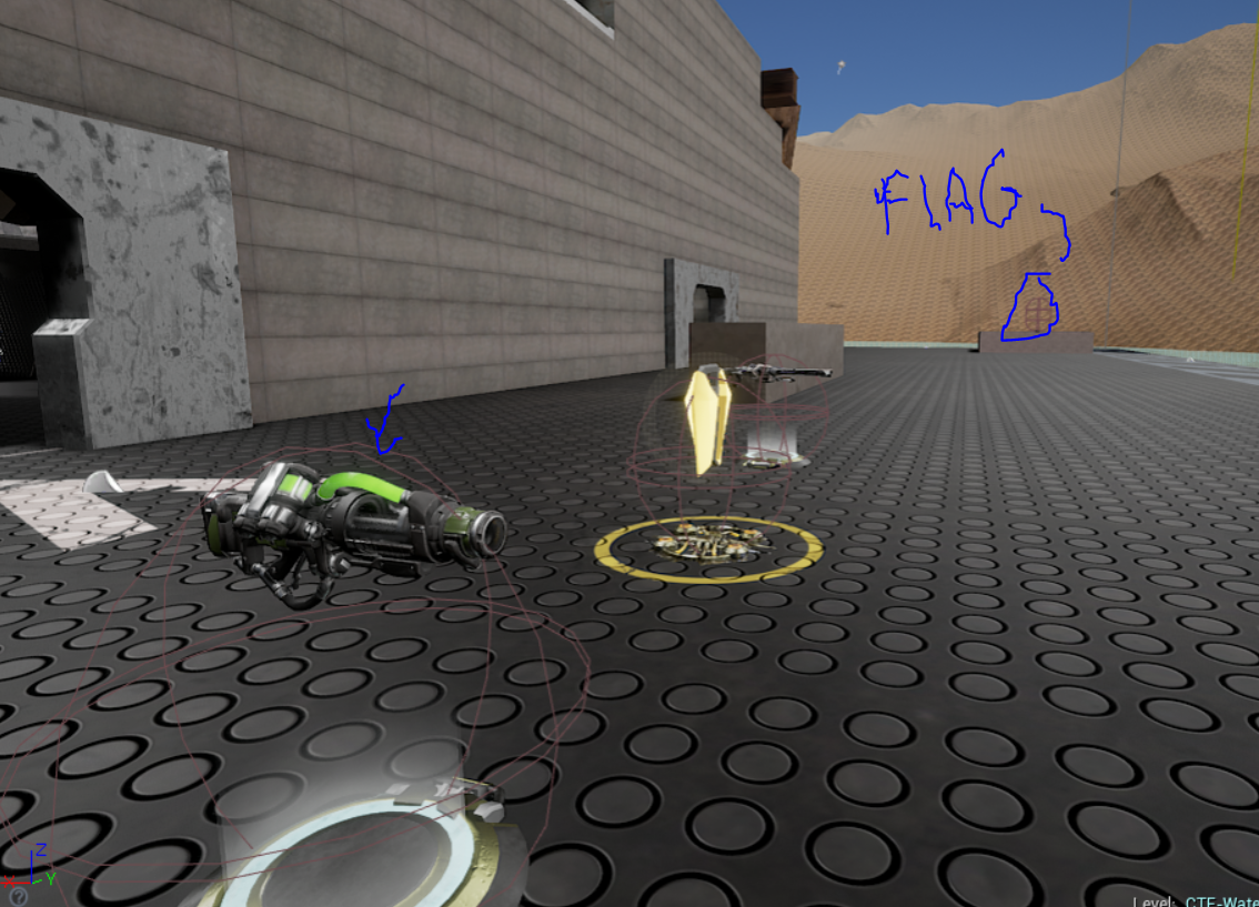
in my level i've tried to locate weapons in different types of locations, i've given the player some poor starting weapons like the bio rifle, firstly because it fits the theme of the level and a water treatment facility would have a lot of bio waste (thats my thinking anyway) and secondly it gives the player another option to fight with instead of the enforcer. the bio rifle is quite a defensive weapon as it allows a player to leave a lot of hazardous goo mines on surfaces so it makes sense to have these near the player spawn so that they can defend it without being overpowered.
for more advanced weapons i've tried to consider what situation the weapon works best in as well as how well it performs generally, for this reason i've put the flak cannon in the sewers as it takes a little bit longer to get to but if you do get it youre in the perfect environment to fight off anyone else who's had the same idea as you due to the fact its very hard to miss someone with the flak cannon in there
also the fact this weapon can shoot a grenade through the sewer openings from below is a very useful feature as well.
when it comes to sniping and looking at the designs of my peers there seems to be a common theme; a high up area that can see pretty much all of the map with incredibly good cover usually positioned at each end of the map, for my level i have changed this significantly to balance the level and stop it becoming a sniping standoff
This sniping position offers some great combat advantages being able to cover the middle of the warehouse but at the same time blocking off some of the enterences so that players can advance and take the sniper out from the side, this combined with the fact that its in the middle of both bases gives either team equal chances to camp and snipe.
Lightning rifle
this has a similar concept to the sniper rifle, its in the middle and both teams have access to it, though its a little harder to get to and if you want to snipe players from near its spawn location youre going to have to move around a lot more as you can only really see about a quater of the interior at a time due to the enclosed walkways cutting off vision. this area is super exposed so ive put the sheild belt as well as some health pickups to let this sniper last a little longer. if the same team has both of these sniper locations they pretty much have the whole of the interior covered.
the minigun placement is designed as a sort of overwatch type of area, its high rate of fire and from this location usually long engagement distance makes it a good suppression weapon. the weakness of this position is from the sides, both teams have jump pad access to the minigun platform as well as surprise roof attacks which again makes it balanced.
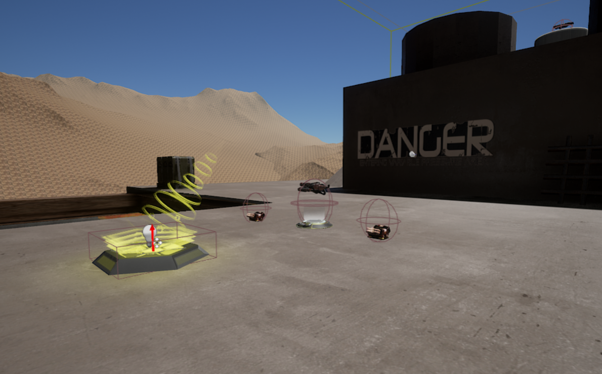
redeemer
the redeemer is proberly the most time consuming weapon to get, for good reason as its the most powerful, as you have to either teleport from behind the sniper tower or venture up the chimneys and onto the jump pads where there is then the danger of falling into toxic gunk. should the player get the redeemer they then fall through the tube and back into the action where they can make quick work of the enemy team. having this tube gets the player back into the action quickly rather than running for another 10 seconds after firing it.
i've tried to put this in a pretty open location as its very hard to lock on to players close to you, from this location you can peek over the roof and fire or quickly hop down and use the single shot mode for closer attacks
there are a few other weapons scattered about such as the link gun, shock rifle and grenade launcher, these dont really have much in the way of strategic locations and were added to give the player an option with gameplay and to fill in some empty space.
overall my main design inspiration for this level was choices, each side has about 6 routes a player can take and switch between, whether its jump padding to the minigun area and switching to the metal covered walkway or heading straight through the middle and jumping down a sewer hole this level has always had "the illusion of choice" (credits, 2017) which is giving the players as much freedom as possible but still binding them to a path
credits, e. (2017). [image] Available at: https://www.youtube.com/watch?v=45PdtGDGhac&index=6&list=PLVvW2fMZoR5sCs6wkCXZ6Q8M8nXLJDgUl [Accessed 30 Nov. 2017].
Credits, E #2. (2017). [video] Available at: https://www.youtube.com/watch?v=ZH2wGpEZVgE [Accessed 30 Nov. 2017].
Tuesday, 28 November 2017
level feedback v3
last playtest of the level and last chance to get some peer feedback
What is your name ?9 responses
Richard
Luke
James E
George
Ethan Boddy
Joe
Michael Bradbeer
Anna Olsson
Charlie
did you manage to use advanced techniques to reach secrets? (wall running, crouch sliding ect)9 responses
Didn't find them
No, I didnt see anywhere to do this.
Only a little, some seemed a bit out of the way
No
I didn't but I did notice them
No nothing like that. I used jump pads.
No as there is a way to bypass the whole level using the side paths and the jump pad
Didn't attempt it but i found you could reach most places with the help of the translocator
No, since items like the redeemer don't retire them
is the level balance the same on both sides?9 responses
Seems to be balanced
For the most part yes.
Yes
yes
It felt correct
Yeah both sides were fine.
not really as the level can all be bypass
yes
Yes, the bases are symmetrical and both paths in the centre are good for running.
were jump pads effective and did they give you good access to new areas?9 responses
Jump pads worked fine, easy to use
I think they were good, although I didnt make the jump once.
Yes, jump pads had enough force to get you to where you needed to be
not really theres a brick wall that looks like I should be able to get in the corridor behin it
Yes they seemed to work correctly
They worked well and helped the flow of the level.
They broke the level as you could bypass the whole place
it felt like the jump pad didnt launch you far enough, i kept bumping the edge on less i didnt move at all whilst in the air
Yes the side jump pads were good for reaching new areas
was flag placement and player spawn placement good or bad and why?9 responses
The flag is vulnerable from one side, but is the same for both teams so works well
I think it was good, although the flag still feels easy to obtain.
The player spawn inside of the building seemed like it had no weapons immediately by it, while the spawn outside had two weapons by it.
nope I want cover so I can defend the flag or hide when both teams have the flag
maybe out the flag in the centre at the back
The flag placement was good I have always liked them. I could spawn camp however easily.
Bad as you could literally go one way to another
it felt like you were spawn right in the middle of everything, very easy to get killed right after spawning
Now that the flags are at the opposite end to the jumppads its much bette.
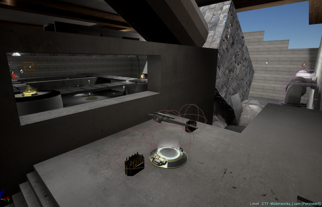
Were the weapon choices appropriate for their locations and did you find them useful8 responses
weapon choice works well
I would say all of them were apart from the bio rifle at the start. It didnt seem to fit the location.
Yes, the weapons felt appropriately positioned and well spread out, though some next to the inside spawn would be better
yes but they were annoying guns hate the bio rifle
yes but I still find the biorifle irritating and a little pointless for the size of this area
Yeah they was good and could always find them.
Bio rifle seems pointless in placement, replace with link guns
a lot of long range weapons a part from the flak cannon
How easy is it to find the power ups?8 responses
Value | Count |
---|---|
1 | 0 |
2 | 1 |
3 | 4 |
4 | 1 |
5 | 2 |
What do you think of the levels aesthetics?8 responses
Level looks nice, the darker areas suit the theme of the map
I think it looked nice, though some random objects in the map. I dont see the point in the barrels.
It looked good and appropriately textured.
they work
Yeah worked well, maybe get it so the sewer area flows better all seemed to flow in one direction if thats not possible make it still and stagnant.
They looked good a few meshes I could walk though.
Seems pointless and you can break through the map
i think it works really well, i did like the sewers the most. The green light fit really well. i also like the random splashes on water that was on the ground.
How good is the weapon selection?9 responses
Value | Count |
---|---|
1 | 1 |
2 | 1 |
3 | 4 |
4 | 3 |
5 | 0 |
Are imported objects and scenart aestheticly pleasing?9 responses
Map looks nice
Yes, I would change the mesh under the redeemer.
Ye
I guess so didn't notice it much
Yes some issues with the tube part and the surrounding square area having gaps
Yeah was fine a few weird aspects of the textures I liked the look of the sewers
Seems pointless and you can break through the map
yes
Yes they fit the level well
is the level improved from the last version?9 responses
Value | Count |
---|---|
Seems the same | 1 |
Unfortunately no as you have gone back | 1 |
Yeah good improvements. | 1 |
Yes | 2 |
Yes the improvements tot the centre area with stairs and meshes really make the level better. | 1 |
Yes, though I didnt explore the underground area because I only found one entrance to it. | 1 |
yes | 1 |
yes especially the lighting | 1 |
How big was the level?9 responses
Value | Count |
---|---|
1 | 0 |
2 | 2 |
3 | 6 |
4 | 1 |
5 | 0 |
Could you accidentally fall off or escape the level? (in an unexpected way)9 responses
Yes | 3 |
No | 6 |
Where there any invisible/unexpected walls ?9 responses
Yes | 1 |
No | 8 |
Did you find the levels easy to navigate?9 responses
Value | Count |
---|---|
1 | 0 |
2 | 1 |
3 | 0 |
4 | 0 |
5 | 2 |
6 | 2 |
7 | 4 |
8 | 0 |
9 | 0 |
10 | 0 |
Was the level to the correct scale?9 responses
yes (2)
As far as I found yes.
Yes
In the areas I went it felt fine
Yeah worked fine and the scale was good.
Level was to the correct scale
yes a apart from the jump pad
Yes the rooms and hallways were large enough to fit multiple players in without problems and they weren't too big
Did you find any Bugs/Glitches/Glaring Issues with the Level?9 responses
No (2)
no (2)
Didn't find any
Not that I found.
the side platform in the middle floats, it is also a little dark.
Not to my knowledge where the redeemer was I couldn't enter the pipe was just floating. Also I could use a jump pad and trans-locate so I was falling forever.
The flag placement is terrible, sewers seems pointless, poor U-damage and redeemer placement. Problems with broken chimneys and the objects being moved seemed to add extra lag to the level. Also if your gonna make people use the side passage, remove the jump pad to the roof.
How would you improve the level?8 responses
Make a sensible way of getting the redeemer. I dont think the metal bridge at the top is useful because there is nothing up there. Also, I was able to use the jump pad by the flag and then walk along the wall to skip most of the map.
Add/move weapon spawns so there are more by respawn locations
make the spawn and flag more covered
I would make the side area just jump to the platform then only able to get into the middle of the map rather than being able to run on the little ledge.
I would make the flow for UDamage and the redeemer easier. The sewers were not used unless you fell in them. they don't add anything.
Remove the jump pad on the side of the building to get to the roof, move the flag placement. Is the roof area really necessary?
maybe make the spawn area a bit safer but other than that and the jump pad it was pretty well
I think adding more to the roof section would make it more interesting.
Subscribe to:
Posts (Atom)